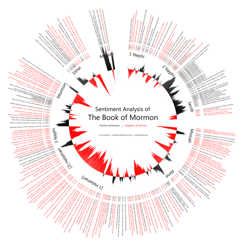
Here is a visual summary of the entire Book of Mormon generated by applying computational sentiment analysis to every verse and then graphing a moving average of the results. I’ve been working on it for a few months when I have had spare time.
View the full large version here (5.8 Mb, 4767 x 4767 px)
For many of you, the initial reaction to this image is probably something like “Cool! Uh…what?” So let me give an overview of what you are looking at, followed by a more in-depth explanation of the technical details.
What is Sentiment Analysis?
Computer programmers and linguists have developed algorithms which take a sentence or paragraph and try to automatically identify the feeling, or sentiment, of the words. Most commonly these algorithms try to identify polarity. Basically, polarity means whether what is being said is positive, negative, or neutral. That automated determination is called sentiment analysis. More ambitious systems go beyond polarity and try to identify specific emotions like happy, angry, or sad.
On the Internet, millions of people are constantly talking about almost everything. Google, Facebook, or Twitter can run sentiment analysis on all the posts and status updates made on their services to identify trends around specific words– not just the most frequent searches or popular topics, but trends in how people feel about those topics.
That kind of information can be extremely valuable. Without disclosing any personal information, Facebook could conceivably gather sentiment analysis of all the posts by its users on a given topic and sell the aggregate information to interested parties. That is part of the reason why Google has made a tremendous effort to get a piece of the social web and created Google+.
Technologically progressive companies, politicians, and other entities can tap into sentiment data to get an idea of how huge numbers of people on social websites feel about their products, brands, policies, or people. For instance, the LDS Church could run an ongoing sentiment analysis of all public posts on Twitter that mention words related to the church (like LDS, Mormon, Joseph Smith, BYU, or Proposition 8 ) and watch the negative or positive changes over time in relation to events, ad campaigns, or announcements.
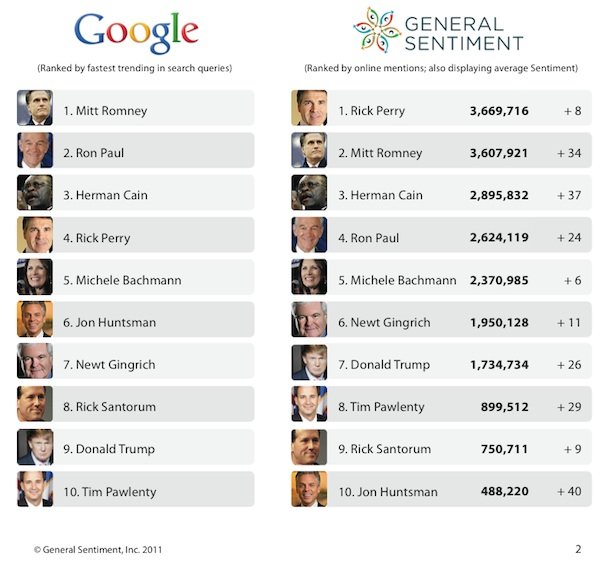
Whether you were aware of it or not, these web companies are already using sentiment analysis in exactly this way. For instance, just last month Facebook posted a graph comparing current Republican presidential candidates based on sentiment analysis of the status updates of their users.
In Google’s 2011 Zeitgeist they also included sentiment analysis results for Republican presidential candidates, as well as many other topics.
I understand that the church is not yet using sentiment analysis of public social network posts to measure positive and negative reactions on the web, but that it is something that they are currently working on.
Sentiment Analysis of the Bible
The idea of running sentiment analysis on scripture didn’t originate with me. Sentiment analysis can be run on any selection of writing and a smart blogger at openbible.info (a site that posts a lot of great projects that apply technology to scripture) realized that just as it can be run on twitter posts, sentiment analysis can be run on verses of scripture. He used a free sentiment analysis service to analyze multiple English translations of every verse in the Bible, and then devised a stunning visualization to display the results. The post got some attention among technology geeks on Google+ where I saw it.
I contacted the author who was kind enough to freely supply me with the code he used to generate the visualization so that I could adapt it for my own purposes.
Sentiment Analysis of the Book of Mormon
To produce the sentiment analysis visualization of the Book of Mormon, I wrote a custom program that submitted every verse to the same sentiment analysis service that had been used to produce the Bible visualization. The service rated each verse as either positive or negative and returned a probability that the analysis was correct. Like the Bible image, I used the probability as a reasonable proxy for sentiment intensity.
The visualization draws a moving average of the sentiment (black is positive, red is negative) in order to see if the sentiment analysis can bring out patterns in the Book of Mormon narrative.
I had some doubts about the validity of parts of the sentiment analysis of the bible; after all the algorithms had been developed to analyze modern English language on the Internet, not the archaic Jacobean English translation of the Bible or the translation of the Book of Mormon. So I was curious to see what it would do with the Book of Mormon.
I’ll leave it to you, the reader, to decide whether the sentiment patterns identified by the program make sense, and if they provide any additional insights. So please share your observations.
Anyhow this has been a fun tangential project. I’m not sure if it really illuminates much other than being a fun, compact, geeky way to represent the whole Book of Mormon.
But now I really need to get back to my rewrite of the Scripturelog project.
Technical Details & Raw Data
Thanks to my continuing work on the Scripturelog project, I already had a convenient database of every verse in the LDS scriptural cannon to start from. Like the original bible visualization, I used the free version of the ViralHeat API to do the actual sentiment analysis of each verse. The free version of the API has a limit on the number of queries that can be made each day, but it didn’t take too long to retrieve and store the sentiment and probability for all 6,604 verses in the Book of Mormon.
I made sure that I was able to reproduce the exact bible visualization that had been posted at openbible.info to be sure I understood how the code interpreted the data. The program expected a tab delimited text file containing moving averages of 15 and 150 verses on each side of the sentiment data. I used the free Tableu Public program to produce the moving averages, and then export them into a LibreOffice Calc spreadsheet. Then I ran the PHP program on the resulting data to generate the visualization.
I then scanned through the entire Book of Mormon and wrote my own short summaries of every single chapter so that they could be displayed by the program around the sentiment visual, similar to the bible visualization.
The first draft was interesting and I was very excited about it. After a close look I noticed a couple of problems, even though it did show some fascinating and promising patterns. For instance, the last chapter of the Book of Ether looked positive, even though it is clearly one of the most bloody, terrible parts of the whole volume. On closer examination I discovered that this was an effect of the moving average. Even though the raw data indicated that the last chapter of Ether was indeed very negative, because the beginning chapters of the subsequent Book of Moroni was so extremely positive, the average masked the negativity near the transition.
The moving average is necessary to smooth out the data enough to bring out some patterns visually, so some of this kind of effect is unavoidable from chapter to chapter, but I decided that at a minimum I should run the moving averages only within the largest logical narrative divisions. I re-calculated separate moving averages for the Small Plates of Nephi (1st Nephi through Omni), Mormon’s abridgement of the Large Plates (Words of Mormon through Mormon), the Book of Ether, and finally the Book of Moroni. The Book of Moroni had so few verses that a moving average of 150 verses basically flattened the data completely, so for that book I used a much lower number of verses in the moving average. Then I adjusted the visualization program to show these divisions and regenerated the image.
At this point I also corrected another source of error. The ViralHeat API has a limitation of 360 characters of text (including spaces and punctuation) per analysis query. In my original script I had simply truncated each verse at 360 characters. In the entire King James translation of the Old Testament, there are only 28 verses that have more than 28 characters. The New Testament only has 1 verse with more than 360 characters. So it made sense to truncate these few long verses without worrying too much about it causing a lot of error.
The Book of Mormon, in contrast, has 538 verses with more than 360 characters, including 2 that are greater than 720! So when these verses were truncated to 360 characters before being analyzed the chances were pretty high that the analysis would come back wrong because the sentences would be syntactically and semantically incomplete.
To correct this problem, I modified my original script to break long verses up into chunks smaller than 360 characters by identifying sentences and clauses that were as likely to be semantically viable. The program favored ends of sentences (periods, question marks, exclamation points) within a verse as dividing points, but failing to find those, looked for semicolons, colons, and hyphens, and failing those fell back on commas and then spaces. Then it submitted these smaller pieces for analysis and stored the results for each one. Then I averaged the resulting sentiment to produce a more accurate sentiment for the entire verse.
With the new separation of the moving average into larger narrative section and the improved sentiment analysis for longer verses, the visualization was starting to take shape.
I noticed, however, that the Book of Mormon visualization was smoother than that of the bible, with longer continuous sections of negativity instead of frequent ups and downs. I realized that the smoothing effect of a moving average of 150 verses on each side was proportionally smaller in relation to the total number of 31,102 verses in the Bible than to the 6,604 of the Book of Mormon. So I recalculated the moving average using 32 verses on each side to produce a similar smoothing effect to the Bible. And that resulted in the image at the beginning of the post.
For anyone who wants to play with it, I am making the raw sentiment data for all of the verses of the Book of Mormon available. In the raw data the sentiment is represented as a number from 0 (negative) to 1 (positive). You can download it as a tab delimited text file here:
book-of-mormon-sentiment-raw.csv
Using the raw data, and the free Tableu Public program linked above you should be able to play around with the data and produce your own graphs without too much technical knowledge and without needing to program anything. I’d love to hear about anything interesting anyone else does with it. Please mention my contribution or link back here in any derivative works. Thanks!


